So this is it! I hope you’ve enjoyed reading this blog and following me as I’ve clumsily navigated the complicated, yet fascinating world of remote sensing.
It’s been a lot of fun, and at times very frustrating, but I’ve learnt a great deal about the various uses of remote sensing as well as the ways in which satellite images can be manipulated and enhanced to maximise their usefulness.
I look forward to seeing what the future will bring to remote sensing.
If you want to delve deeper into the field of remote sensing, here are a few links to get you started!!
Now its all well and good spending half a billion dollars putting a satellite in orbit around earth, but if you can’t effectively use the data that it sends back then what’s the point?!
To complete the practical section of this course, I had to get to grips with the software that was needing to be used. The ENVI software is both the most frustrating and yet brilliant thing I have used thus far at the University. It has the ability to adapt and manipulate satellite imagery so that it becomes useful and can be applied to full effect.
Admittedly, it took me a LONG time to get to grips with even the most simple of tasks, but once I had finally managed to open up one of the images and played around for a while I was able to make simple true and false colour composite images by assigning different bands to the display colours. By assigning different bands ie. band 4 as NIR, its possible to identify different land cover types based on the reflectance and absorption of the various wavelengths.
Image demonstrating the usefulness of making a false colour composite – the detail of what’s vegetation and what isn’t is much clearer now (Source: Kelcey & Lucieer)
One of the simple ways to enhance an image is to use a linear stretch which literally stretches the minimum and maximum data values to the ends whilst rescaling the values between the two points. By using linear stretches on each of the three bands in use, I was able to increase the definition and contrast between, in the case of practical 3, the wetlands and the estuary.
Another image enhancement that could be made is a Histogram Equalisation. Essentially, it reassigns the digital values in the original image so that the brightnesses in the output image are more equally distributed across the output value range. Different to other stretches, histogram equalisation broadens the peaks and makes the valleys shallower so as to make full use of the data range (Campbell & Wynne, 2011).
An example illustrating the benefits of Histogram Equalisation (admittedly not a satellite photo…) (Source: songho.ca)
Fun Fact: The first colour a baby see is red. Because it has the longest wavelength among colours it makes it the easiest colour to process by the developing receptors and nerves in the baby’s eyes!
Visit: crisp.nus.edu.sg for more information on image enhancement!
References:
Campbell, J. B. & Wynne, R. H. (2011), Introduction to remote sensing, 5th edn., New York: The Guilford Press, pp. 120.
Kelcey, J. & Lucieer, A. (2012), Sensor Correction of a 6-Band Multispectral Imaging Sensor for UAV Remote Sensing, Remote Sensing, 4:5, pp. 1462-1493.
As I think it has been well established that remote sensing is beyond useful for a myriad of applications, but here’s another example anyway!
Hurricanes, they blow! But mapping their progress and development can lead to reducing the costs, both in human lives and money, for future weather disasters. collecting images of hurricanes and tornadoes allow analysis to:
Identify escape routes;,
Crisis mapping,
Assess impacts,
Monitor the cyclones,
Predict storm surges.
Image showing the before and after of the tornado that killed 5 people in Maryland in 2002. Vegetation is in red, urban areas in blue-green, and the dark turquoise gash cutting across the image is the track of the tornado (Source: ASTER)
The two images used in this post show the destructive nature of tornadoes in both urban and rural areas. RS can be used to identify the points which suffered most as well as those that withstood the strong winds.
Incredible image showing the destruction path of the Tornado that ripped through Western Alabama (Source: NASA)
By changing the bands used to display the image, a false colour composite can be created to better show the data and allow analysis to use the images more efficiently.
Fun Fact: Every second, a large hurricane releases the energy of 10 atomic bombs!
At least that was my position on the subject a few weeks ago, now however I am fully clued up on the ins and outs of NDVI.
Essentially its a method of determining the density of greenery (aka vegetation) that covers a certain area. The Sun emits many wavelengths across the Electromagnetic Spectrum (read my early blog post on the ES here) and when the Sun’s light hits various objects certain wavelengths are either reflected or absorbed depending upon the object’s characteristics.
The pigment in plants, called chlorophyll, has certain properties that mean it strongly absorbs visible light, and heavily reflects NIR. The greener a plant, ie. the healthier it is, the more visible is absorbed and NIR reflected. Using the resulting NDVI values, the health and density of vegetation can be determined (earthobservatory.nasa.gov, 2000).
Once the NDVI values have been gathered they can be used not only to map vegetation density and heath changes over a period of time, but also show the impacts that certain events have had on the environment. This could be the results of a tsunami, earthquake, flooding, conflict etc.
NDVI value for August (right) and April (left) in 2008 in the Darfur region of Sudan.
As you can see from the images above, the vegetation health in the Darfur region is significantly better in the south of the area studied. What’s more, the changes in NDVI values across the year show a cycle of growth and depletion in vegetation health and density. Looking at the chart below, the trend is displayed again showing a fluctuation in NDVI values across the year.
Fun Fact: Earth is the only known planet where fire can burn!
References:
Campbell, J. B. & Wynne, R. H. (2011), Introduction to remote sensing, 5th edn., New York: The Guilford Press, pp. 7.
Normalised Burn Ratio or NBR refers to the use of Landsat imagery to study the land cover change as a result of fires as well as the extent of burning.
Fire is one of nature’s most destructive forces, almost anything can be destroyed by it and, unless under perfect circumstances, is almost impossible to control. RS can be used to understand the impacts of fire on and area, particularly the impact it has on vegetation.
Healthy vegetation has a very high NIR and a low reflectance in the SWIR section of the spectrum. Once vegetation is burned (and then no longer healthy) these characteristics reverse, ie. high SWIR values and low NIR values. High NBR values generally indicates healthy vegetation while low values indicates bare earth and therefore recently burned areas (gsp.humboldt.edu, 2017).
NBR can be calculated using a formula not unlike that for calculating Normalised Difference Vegetation Index (NDVI):
Calculating NBR can be used to monitor the regrowth of vegetation following a severe fire. It is used around the world by conservationists, environmentalists, and forestry commissions.
Relative difference Normalised Burn Ratio can be used to get even more detailed results. The RdNBR allows for better a estimate of the burn severity in an area by removing the correlation of NBR and pre-fire biomass:
RdNBR image from Landsat 8 showing the severity of the fire at Barry Point in 2012 following a lightning strike. (Source: http://www.directionsmag.com)
These crazy beetles actually seek out burning forests so they can mate and lay their eggs where the vegetation can’t fight back.
Fun Fact: There is a beetle (known as the Fire Beetle) that uses specialised infrared radiation sensors to detects forest fires. Once they have located the fire, they mate and lay the eggs in the scorched trees. The US Department of Defence has extensively studied the beetle’s infrared sensors in the hopes they could use it to develop heat-seeking missiles!
The Electromagnetic Spectrum is remembered fondly in our hearts as being one of the few useful things to come out of the countless GCSEs we had to endure. The spectrum is made up of a several sections. Visible light (Blue (0.4-0.5 μm), Green (0.5-0.6 μm) and Red (0.6-0.7 μm)) is the only electromagnetic radiation that can be seen by the human eye, but there are also other sections invisible to us that can be used in remote sensing.
One of the most useful sections of the spectrum regarding remote sensing is Infrared Radiation. It has a broad range (0.7 μm- 1mm) and therefore includes radiation with differing properties e.g. Near-Infrared, Mid-Infrared, and Far-Infrared.
All objects (unless at absolute zero) emit electromagnetic radiation. By monitoring the amount of electromagnetic radiation that an object emits or reflects, analysts are able to deduce the type of land cover on the Earth’s surface. This has all sorts of real-world applications that are invaluable in both Geography, and other fields of study.
Fun Fact: All electromagnetic waves travel at 300,000km per second!
References:
Natural resources Canada, (2015), The Electromagnetic Spectrum, Available at: http://www.nrcan.gc.ca/node/14623, (Accessed on: 20th May, 2017)
Edwin Starr sang of the devastating impacts of wars around the world, I wonder if he too was a fan of RS?
Wars, while obviously have devastating consequences and deeply affect those affected, often mark some of the biggest advances in technology, and remote sensing is no different.
Because of the need to constantly get the upper-hand over an enemy, technology is forced forwards. The results are often impressive, if not slightly tainted by the reasons for their creation. As mentioned in an earlier post, the two World Wars as well as the Cold War all helped push remote sensing on in its development.
This post is focused mainly on the use of RS to determine the impacts of war in the end of the 20th and start of the 21st centuries.
The use of remote sensing for monitoring the impacts of the Gulf War between Iraq and Kuwait was one of the first to gather media and public attention (Al-doski et al, 2013). For the first time, the satellite images gathered by various scientific and military bodies were being released to the public.
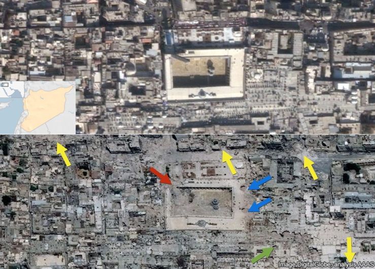
This satellite image shows damage to the Great Mosque in Aleppo, Syria. Remote sensing can be used to further detail exactly to what extent the damage is.
Remote sensing instruments are still surprisingly limited to study war and conflict impacts and still the ability of satellite imagery for detecting war impacts such as: bullet-pocked walls, abandoned buildings and individual mines are limited and difficult due to spatial, spectral and temporal characteristics of the data
(Al-doski et al, 2013).
References:
Al-doski, J., Mansor, S. B., Mohd Shafri, H. Z. (2013), War Impacts Studies Using Remote Sensing, IOSR Journal of Applied Geology and Geophysics, 1:2, pp. 11-15.
Remote sensing relies heavily on photography and so their histories and subsequent development are intertwined. While there were several attempts made to capture images using photography, it wasn’t until Louis Daguerre (the man with the glorious moustache on the right) reported the results from his experiments with photographic chemicals in 1839, that photography was born (Campbell & Wynne, 2011).
Once man had acquired the ability to take photographs, the next step towards remote sensing was to take an aerial photo and Gaspard-Félix Tournachon was the man to do just that! In 1858, after attaching an early camera to a tethered balloon, Nader, as he was affectionately known, captured an aerial shot somewhere in France (all his aerial photographs have been sadly lost so the exact location of the image is unknown, although many early shots from other pioneers still remain).
While it would be a stretch to refer to these early images as ‘remote sensing’, they certainly led the way for the field to be born.
We have to jump forward to WWI before aerial photography became routine and, while it was still somewhat rudimentary in method, proved extremely useful for reconnaissance and surveillance. Obtaining aerial images allowed for better informed military decisions as well as predictions regarding enemy movement (Baumann, 2014).
WWII marked a turning point in the history of RS; the use of electromagnetic radiation moved from using exclusively visible light to include both infrared and microwaves. While their existence had been known for over a century prior to the war, practicality hadn’t been obtained until this point.
Photographic reconnaissance has been our main source of intelligence in the Pacific. Its importance cannot be overemphasized.
(Admiral J. F. Turner, 1945)
Aerial photography continued to provide useful images for a variety of uses. It was notably used during the Cold War periods by both sides to provide recon of missile development and testing. This period also saw the first satellite images and it became possible to routinely gather visual information from space.
Landsat 1 (Source: airandspace.si.edu)
Remote sensing was also used for civilian work such as to assess and identify problems in crops, as well as degradation of forested areas and coastlines. The field developed in leaps and bounds and by 1972 Landsat 1 was launched. Landsat 1 was the first of many Earth Orbiting satellites that would document land surface change on Earth (Campbell & Wynne, 2011).
As with much of the technology in the 20th Century, remote sensing and the data gathering satellites it used developed at an incredible rate. Within 60 years, the field essentially went from a man leaning over the side of a plane with a camera, to the first orbiting satellite over Earth!
So keep an eye out, who knows what could be next…?
Fun Fact: In 1976, Landsat 1 discovered a tiny uninhabited island 20km off the eastern coast of Canada. In its honour, the island was named Landsat Island!
Remote Sensing has been variously defined but basically it is the art or science of telling something about an object without touching it.
(Fischer et al., 1976)
Just some light reading for the holidays…
Before starting the course, I had no idea what remote sensing was set to entail. I wasn’t even totally sure what Remote Sensing was! I was looking forward to learning out the various methods involved with RS as well as the roles it plays, not just in academia, but in our everyday lives.
Armed with a basic understanding of the electromagnetic spectrum and a textbook thicker than Joey Essex, I embark on a journey into the colourful world of Remote Sensing!
Fun Fact:Remote sensing is used for countless tasks, one more obscure is to predict retail earnings by counting the number of cars in car parks!
References
Fischer, W. A., Hemphill, W. R., & Kover, A. (1976), Progress in Remote Sensing, Photogram-metria, 32, pp. 33.


 The Electromagnetic Spectrum is remembered fondly in our hearts as being one of the few useful things to come out of the countless GCSEs we had to endure. The spectrum is made up of a several sections. Visible light (Blue (0.4-0.5 μm), Green (0.5-0.6 μm) and Red (0.6-0.7 μm)) is the only electromagnetic radiation that can be seen by the human eye, but there are also other sections invisible to us that can be used in remote sensing.